Tuesday, March 18, 2014

Jhonen Vasquez: Taking Over-Exaggeration to an Extreme

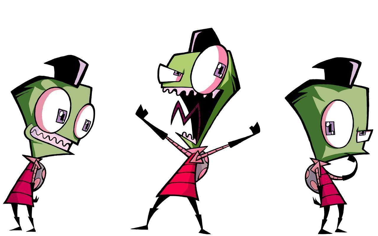
One of Vasquez's character designs, the middle of
which is a typical over-exaggerated expression.
As an artist, it's always fun to look at the work of other artists, especially the ones who's work I particularly admire. Recently, I've been looking at a lot of Jhonen Vasquez's work. He's worked on various things, most of them comic or TV related. Some of his most popular works are 'Invader Zim,' 'Johhny the Homicidal Maniac,' and 'Randy Cunningham: 9th Grade Ninja.'


"Floor Damage" by Jhonen Vasquez
Most of his work I don't care much for. His characters are generally more over-the-top than I like and drawn in a way that is intentionally gross. He also frequently over-exaggerates his characters' facial expressions when conveying an emotion. I do like his character designs for 'Randy Cunningham,' as well as his intense action pieces. My favorite of his pieces, to date, is 'Floor Damage.' I love the strong, emotional expression, the action and lines of action, the monstrosity emerging from the floor, and the loose, abstract nature of the figure.

Most of Vasquez's work has a horror feel to it, like something otherwise normal has gone terribly, terribly wrong. Most of his art, as I mentioned above, takes this to an extreme: he achieves the horror feel by deforming some main attributes as much as he possibly can. For what I feel are his better pieces, he only treads the edge of the horribly wrong and down-right ugly. Instead of over-emphasizing the character, he over-emphasizes the action. These more subtle pieces of his have been my inspiration for one of my more recent pieces. As of yet, it is untitled.
"Untitled" by Amaryllis

In my piece, I mimicked his character designs in 'Randy Cunningham' for my main character. I tried to exaggerate the action in my character to create the horror feel, then drew on the various horror movies I have seen to create a monstrosity. I don't think that I'm anything like as good of an artist as Vasquez, nor do I think my design carries the same feel as his work. I did appreciate having his work to draw on to expand my own capabilities, however. I hope to someday be as capable an artist as Vasquez, while creating far less ugly and over-done works.

The Sam Francis Exhibition: Minimalist Abstract Art In Sacramento

Image courtesy of MasterworksFineArt.com


Recently, I went to the Sam Francis exhibition at the Crocker Art Museum in Sacramento. Sam Francis is an abstract expressionist painter who was most active around 1950-80. He served in the Air Force during WWII. He was injured and hospitalized for several years before he was visited by David Park who inspired Francis to begin painting.
Image courtesy of SamFrancisFoundation.com


When I first went to see Sam Francis' exhibition, I wasn't expecting much. I'm generally not very fond of abstract art: I prefer to see the technique and artistry of art genres such as Classical, Neoclassical, Raphaelite , Baroque, or Realist. I must say that I was enchanted by Francis' work. Most of the paintings that I saw in the exhibition were from around the mid-60s to 70s. The art consisted of strong colours, separated by large white areas.

The installation was a nice one, in my opinion. The white walls and open spaces reflected the feel of the paintings. The furnishing was also simple and non-obtrusive. The paintings were mostly arranged to have one painting set next to another, with some space in between.  Some of the smaller, square paintings were 'stacked' one on top of the other. As a whole, the paintings were arranged similar to the manner in which they were composed: splashes of colour and design separated by expanses of white space, which emphasized and drew attention to the focus of the piece.

The space that was used to display the paintings was sufficiently large to avoid a cramped, claustrophobic feeling. The pieces had the necessary room so that you didn't feel like you had a sensory overload. The organization of the rooms divided the pieces into the different styles that Francis used over time.

Overall, I feel that the exhibition was well laid-out: it maintained the feel of the abstract paintings and imitated the composition style. I think that 'copying' Francis' art in the design of the exhibition was the best way to emphasize his work. I also think that the paintings themselves were very nice.